
Movement Breakdown Visual
See how different components contribute to the total movement into and out of a specific population.
The Movement Breakdown visual shows how a metric, for example, Headcount is affected by a series of positive and negative values. The visual breaks down a metric into its individual components and shows how they positively or negatively contributed to the net change of the metric value.
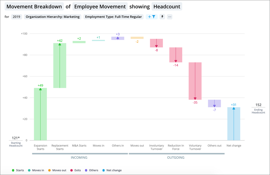
The vertical axis represents a value scale and the horizontal axis represents the individual components of the metric. The metric value at the start of the selected time period is shown on the left side of the visual and the metric value at the end of the selected time period is shown on the right side of the visual. Data is presented as a series of vertical bars. Each bar shows the amount that the individual component adds to or subtracts from the metric value.
Depending on the data, you may see the following additional measures:
- Net Change: The difference in the metric value from the start of the selected period to the end of the selected period.
- Discrepancies: Changes in the metric that cannot be attributed to any of its individual components. For example, a decrease in headcount is detected, but due to missing or incomplete records, the solution cannot determine why the employee left the organization. Since the solution cannot attribute the change in headcount to one of its components, the change is counted as a discrepancy. For more information about discrepancies that may appear when analyzing Employment Movement, see Why do discrepancies appear in the visual?
Note: To change the labels displayed in movement visualizations, see Create a Movement Concept.
Depending on the data that has been loaded and configuration, you can use the visual to analyze different types of movement. The configuration and definition of the types of movement being tracked can be adjusted by your administrator.
Change the visual title to analyze:
- Employee Movement in terms of Budgeted Direct Compensation, FTE, or Headcount.
- Requisition Movement in terms of Open Positions Count or Open Requisitions Count.
Movement overview
The following section uses the Employee Movement model to explain how the visual works. By default, the Employee Movement model is configured to analyze movement based on Organization and Location (primary attributes). For more information, see Employee Movement Model.
Note: The Requisition Movement model is configured to analyze movement based on Requisition Status.
For Employee Movement, the visual highlights:
- Starts: Employees that joined the group from outside of the organization.
- Exits: Employees that left the group by leaving the organization.
- Internal movement: Impacts to the group from existing employees due to changes in the primary attributes. By default, this shows employees who have changed organizational units or locations. Movement for Moves in and Moves out will only appear if you have applied a filter based on a primary attribute to the visual.
- Moves in: Existing employees who joined the group, as a result of changing their organizational unit and/or location.
- Moves out: Existing employees who left the group, as a result of changing their organizational unit and/or location.
- Moves within: Existing employees who changed their organizational unit and/or location, but still remain part of the group.
- Other movement: This movement type will only appear if you have applied a filter based on a secondary attribute to the visual. For Employee Movement a secondary attribute is any filter that is not based on Organization or Location. This summarizes employees who had changes relevant to the filter that stayed in the group throughout the period:
- Others in: Existing employees who joined the group, as a result of a change related to the filter.
- Others out: Existing employees who left the group, as a result of a change related to the filter.
How to interpret the movement metrics
Let's say, you're analyzing Employee Movement for the Marketing unit and you've applied a filter defined as Organization Hierarchy: Marketing. Here's how you should interpret the movement:
- Starts: New employees who joined the organization in Marketing.
- Exits: Employees who left the organization in Marketing.
- Moves in: Existing employees who joined the group by changing organizational units or locations. For example, an employee moves from Sales to Marketing.
- Moves out: Existing employees who left the group by changing organizational units or locations. For example, an employee moves from Marketing to Finance.
- Moves within: Existing employees who are still part of the group who changed their organizational unit and/or location. For example:
- An employee moves from the Marketing unit in New York to the Marketing unit in Los Angeles.
- An employee moves from the Product Marketing unit to the Demand Generation unit.
- As part of a reorganization, an employee reports to the Content Marketing Manager instead of the Vice President of Marketing.
Let's say, you're interested in the movement of full-time employees, so you apply another filter using a secondary attribute defined as Employment Type: Full-Time Regular. Here's how you should interpret the movement:
- Others in: Existing employees who joined the group, as a result of a change related to the filter. For example, an employee in Marketing who becomes a full-time employee.
- Others out: Existing employees who left the group, as a result of a change related to the filter. For example, an employee in Marketing who transitions to part-time.
How to explore the visual to gain insight
- Set the analysis population by applying filters to isolate the population of interest.
- Determine how a metric has changed over a time period, identify the types of change that impacted the metric most, and then conduct further analysis on these components.
- View a summary of each component in the Info panel by selecting a bar.
See where specific subject members moved in from or moved out to. Select Moves in or Moves out and then click View Details to answer questions like: Which location did this employee come from? In Detailed View look for the attributes that are included in your analysis context to see the subject member's source and destination. For example, California > New York indicates an employee moved from California to New York.

- Compare a group's movement values to the overall movement by highlighting a group in the Compare to panel. For more information, see Highlight a Group.
Tip:
-
Right-click on a chart item or data point to open the Visual Item Actions menu. Find actions that will allow you to quickly interact with points of interest. Actions include drilling up or down to view different levels of your data and accessing the Detailed View visual to see a list of subject members or event occurrences that make up a given population.
-
By default, zeros, null (N/A) values, and the Others data item are hidden.
-
To change the default settings, click your User icon
 > Preferences
  > Charts.
Why do discrepancies appear in the visual?
Employee movement is based off the employee profiles, start events, and exit events data that you send us. Discrepancies appear when there is a difference between the employee profile and the start/exit events data. During the data load process, the solution will generate system events based on a mismatch between the state of the employee profile and the associated event. These system events help to fill in missing records and reduce the discrepancies.
Example: A system exit event
- The record for Employee A ended on January 31, 2018 and so they no longer contribute to the headcount on February 1, 2018.
- There is no record of an exit event for Employee A in January.
If the employee no longer contributes to the headcount, the latest event must be an exit event. In this example, there was no exit event provided for Employee A, so the solution generates a system exit for Employee A for January 31, 2018. The system exit accounts for the removal of Employee A's employee profile from the data. The system exit event can be counted as part of the Exit metric so that exits plus headcount are equal to the prior headcount.
System generated events ensure that discrepancies do not appear in the Movement Breakdown visual because changes to the headcount can be associated with a start or exit event. However, discrepancies may occur when:
- System events are intentionally removed.
- Users have limited or no access to data.
- An employee has a start and exit event on the same day.
System events are intentionally removed
You have the option of removing system generated events from your Hires Count or Exits Count by not mapping system events to a start or exit category. However, this will lead to discrepancies in the Movement Breakdown visual because changes in the headcount data cannot be paired with a start or exit event. The best way to remove system events is to send us correction files that contain the missing events. Alternatively system exit events can be mapped to the Other Exits category, so they are counted but do not change the Turnover metrics.
Users have limited or no access to data
Discrepancies appear when users have limited or no data access to the individual components of a metric. For example, a user who has access to all employees but no access to Voluntary Turnover Count (a component of the Headcount metric) may see discrepancies. Since the solution cannot attribute the change in headcount to one of its components, the change is counted as a discrepancy. In this example, any employee exit classified as voluntary will be counted as a discrepancy.
Tip: To avoid discrepancies from appearing, we recommend that you give users the same level of access to employees, starts, and hires data.
How does a user's security context work with the visual?
The Movement Breakdown visual is calculated based on the data that you have access to, your security context. To ensure that discrepancies don't appear when you gain or lose access to a subject member in your analysis population, the solution will do the following:
- If you lose access to a subject member in your analysis population due to security access, it will be counted as an Others Out
- If you gain access to a subject member in your analysis population due to security access, it will be counted as an Others In.
Highlight a group
When a group is highlighted in the Movement Breakdown visual, the group's movement values are overlaid on top of the overall values.
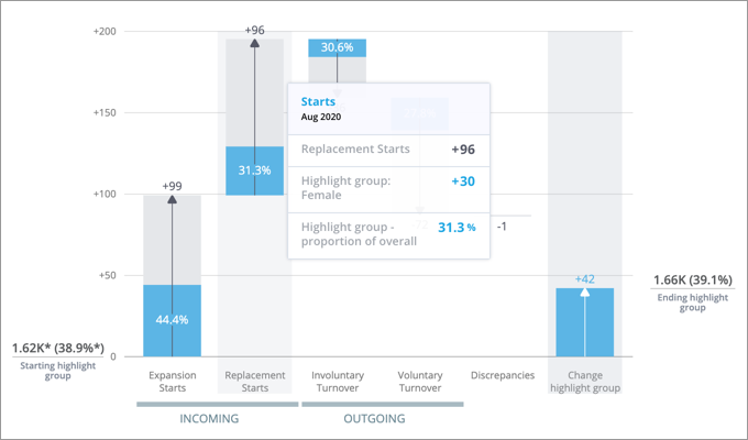
For each component, the highlighted portion of the bar shows the proportion of the group to the overall. Let's say you're looking at Employee Movement and there were 96 Replacement Starts overall and 30 Replacement Starts for the group that you've highlighted (for example, women). The proportion of the overall for the group is 31.3% (30/96). In this example, this means that 31.3% of the Replacement Starts were women. When a group is highlighted, the Insights tab of the Info panel shows the net change of the proportion of the group to the overall during the selected time context.
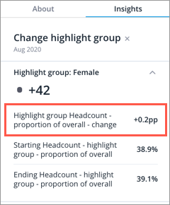
When analyzing employee movement, highlight a diverse group in this visual to see how employee movement has impacted diversity. For example, highlight women to see how the proportion of the group to the overall has changed. If the net change is negative, identify and address the individual movement components that contributed the most to the decrease in diversity. In this example, the proportion of women has increased by 0.2 percentage points during the period.
For more information, see Highlight a Group.
Add traffic lighting rules
You can also highlight metric performance by applying traffic colors to the visual. For more information, see Traffic Lighting and Add Traffic Lighting Rules.
In the Movement Breakdown visual, traffic lighting can be applied to the Net change metric.